The Evolution of Foldable UX: How Samsung Elevates the UX Design of Z Flip4 and Z Fold4

Last month, Samsung Electronics unfolded a new future of mobile possibilities with the release of the new Galaxy Z Flip4 and Z Fold4. Flexible screens that can fold and unfold seamlessly come with endless UX design opportunities. Not only do Galaxy users want a phone that fits in their pockets, but they also need a mobile device that is designed to offer meaningful, relevant and flexible experiences to fit their daily lifestyle.
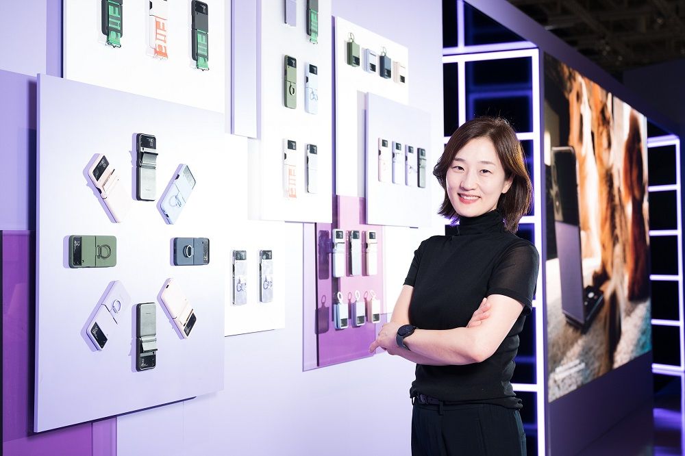
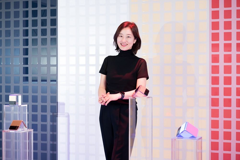
To help users understand more about the journey of foldable UX design evolution, Samsung Newsroom sat down with Yoojin Hong, Executive Vice President and Head of User Experience, Mobile eXperience Business at Samsung Electronics. As a leader in the global UX design of Samsung mobile products, the Q&A below includes exclusive insights on all things flippable and foldable.
Read on to learn more about Samsung’s goals for the Z Flip4 and Z Fold4 and the process behind the smartphones’ flexible and bold designs.
Q: What inspired the creation of Samsung’s lineup of foldables? How has the device enabled new experiences for users?
As smartphones became an essential companion in our daily lives, users began to demand larger screens, and the race was on to deliver just that. At the same time, users wanted pocket-sized and portable devices — two seemingly opposing asks. So this posed the question, how could we reconcile these demands while solving the problem? Samsung’s solution was simple, though not easy: fold the screen.
While this was a huge undertaking in itself, developing folding screen technology was only the beginning. Once we had these new form factors, we realized that designing UX for a foldable was different from a traditional smartphone. We had to rethink the smartphone experience entirely. We also discovered, over time, that these new form factors had the potential to change people’s relationships with their phones. Changes in form factor also lead to new life patterns, and not just for advanced users, but for everyday users. Foldables met evolving user needs in surprising ways.
Q: What is Samsung’s UX design philosophy for foldable?
When creating a user experience on a phone, most companies only need to account for a single static screen. But foldables are moving devices with two screens, so the UX must be more fluid. This has been the basis of our entire design philosophy since the beginning.
Our design philosophy for foldables revolves around two foundations. First, UX design that is new yet familiar. Foldables offer consumers a new form factor, which delivers a variety of different and innovative benefits. However, while the user experience is new, it shouldn’t be unfamiliar — there should not be a steep learning curve. For foldables, we design with the idea that the UI should be almost invisible. It should be so intuitive that users are instantly familiar and can navigate with ease.
The second foundation is to remember that foldables are tools that help users create. Smartphones have evolved from literal phones to devices that can unlock creativity through photography, art, gaming and more. We want to ensure our UX enhances these experiences.
Since that first Galaxy Fold, we’ve launched a new generation of foldable phones every year. These phones have evolved in so many unexpected ways — some of which were planned from the beginning, while others were guided by our learnings over time in addition to the invaluable feedback from our users.
Q: What are the differences in the user base between Z Flip series and Z Fold series?
Z Flip series and Z Fold series are both foldables, but they have very different form factors with distinct user bases. Z Flip users see their devices as a form of self-expression and enjoy the versatility and personalization the form factor provides. Z Fold users gravitate to the large-screen experience with the ability to do and see more at once. They love getting things done quickly and then having more time to focus on what’s more important to them.
These separate user bases also gave distinct feedback on the previous generations, which led to our focus areas for Z Flip4 and Z Fold4. For Z Flip, we wanted to give even more ways for users to express themselves and personalize their experiences. For Z Fold, we wanted to enhance large-screen interactions, specifically around multitasking.
What’s important to remember, however, is that these new devices are not just for advanced smartphone users — they’re for everyone.
Q: How have the UI and customization features been improved for the latest Z Flip4?
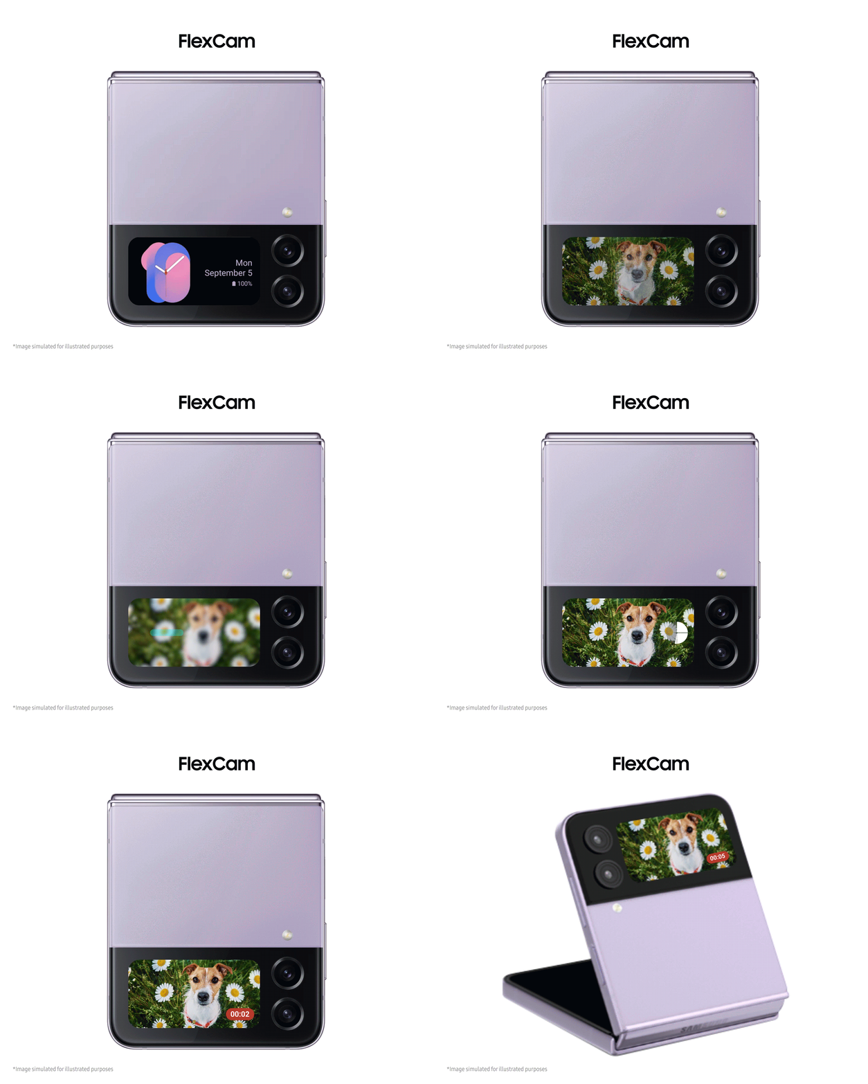
With Z Flip4, users can personalize the entire look of their device, from the hardware color, accessories, Main Screen UI — and now Cover Screen UI. Customization goes beyond simply decorating a phone’s UX — it also includes customizing the user experience. The Z Flip4 offers a new level of Cover Screen functionality, where users can not only customize the Cover Screen design but also take advantage of a variety of useful widgets and other functions.
We also noticed that Z Flip users were taking advantage of the unique photo-capturing experiences offered by the form factor. So, on Z Flip4, we continued to provide features that promoted self-expression and enhanced the UI of the camera to open up new possibilities for the FlexCam.
Q: How is UI improved users boost their productivity and save time with the new Z Fold 4?
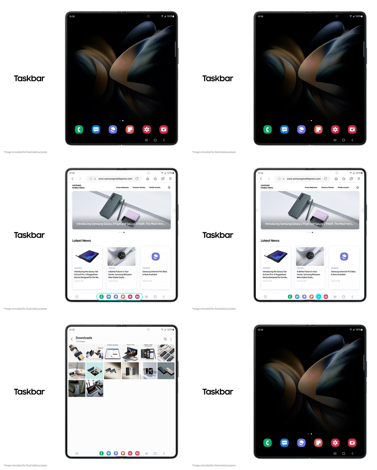
We’ve improved interactions and eliminated steps in activating settings and redesigned menus and layouts to bring action buttons closer together. This is important on a large screen as it reduces the amount of finger “reaching required” for the most common inputs.
We also wanted to simplify the large-screen experience by enabling faster app switching and activation. To accomplish this, we’ve added Taskbar, a familiar app bar that can always be activated, no matter what app you’re using.
Finally, we’re also giving more flexibility in how multiple apps can be viewed on the screen with finger gestures that enable a split window or pop-up window. One-finger swiping at a corner makes the currently used app shown on a pop-up window. Two-finger swiping on the right, left or bottom makes the currently used app split in half. This allows you to be more productive, so you can achieve more in your daily life.
Q: How have Samsung’s collaborations set the foundation for the entire foldables market?
We have worked with Google to create this ecosystem together from the beginning, often inspiring each other to develop new features or technologies. From the beginning, we worked closely with Google to fulfill our foldable vision, even collaborating at the code level to modify Android to meet the needs of foldable devices. We knew we would need to enhance Android to run effectively on new screen dimensions, and this work served as step one of our foldables journey long before any hardware was announced.
And, of course, we continue to work with our biggest partners, including Google, Meta and Microsoft, to bring optimized experiences on foldables to life. Now, apps like Chrome, Gmail and Microsoft’s full Office suites and Outlook take advantage of the Z Fold series’ large screen for the ultimate multitasking experience. Thanks to our partnership with Meta, FlexCam is optimized for the most popular social platforms, including Instagram, WhatsApp and Facebook.
I believe it is extremely important to both build a Foldable ecosystem to diversify user experiences and continue to expand the app ecosystem through an open collaboration philosophy.
Q: User behavior — and thus, user experience — is constantly evolving. How would you summarize your approach to keeping up with new consumer demands?
In our previous devices, we approached our UX design by starting with what was necessary and tackling the challenges. Then, we developed new technologies to provide more screen space while keeping the devices compact. The new designs didn’t just solve existing problems; they also transformed user behavior, changing the way people take photos, interact with their phones and more. These new behaviors have become natural parts of the everyday lives of the people who use foldable phones.
They also, of course, create all new challenges — and that’s what drives us forward as UX designers. Users imagine new possibilities, and those possibilities become demands. It’s our responsibility to create the innovations to meet them. As the cycle of innovation continues, we’re excited to get to work building the foundation for what’s next.

